


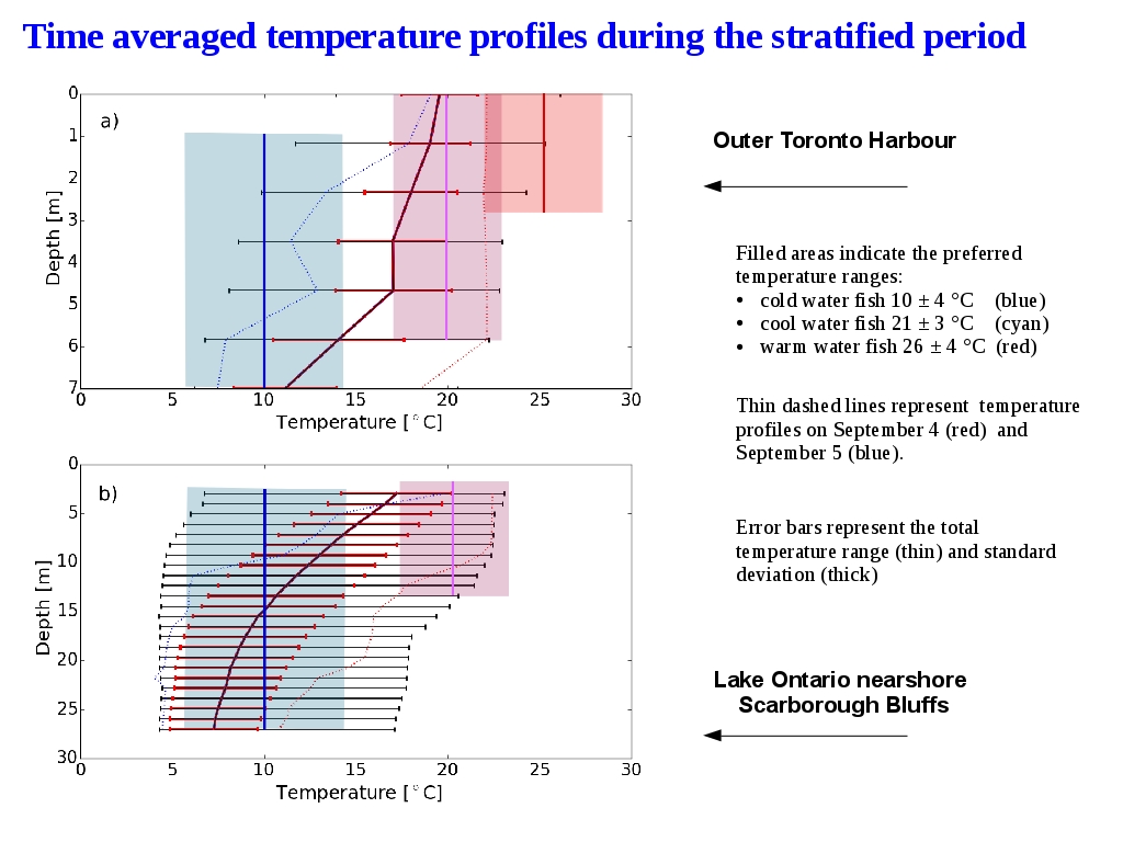
We have here the figures representing the average temperature records in Lake Ontario (bottom) and Toronto Harbour (top):
●The thin, black horizontal error bars represent the temperature range during the stratified season.
●The thicker red horizontal error bars represent the standard deviation.
●The Toronto Harbour profile does not look like the normal S shaped curve of a stratified body of water, and has large ranges at all depths. It looks more like a mixed body of water in the upper layers.
In addition, with dotted lines are represented the temperature profiles before (red) and during an upwelling event (blue) at a time interval of 12 hours.
Superimposed, the filled rectangles indicate the preferred temperature ranges for cold, cool and warm water fish.
If we compare average temperature profiles in lake Ontario and Toronto Harbour with the optimal ranges for:1) Warm water fish, 2) Cool water fish , 3) Cold water fish
Visually analysing the figures we can see that optimal temperatures for cool or warm water fish can change in Toronto Harbour a matter of hours to optimal temperatures for cold water fish